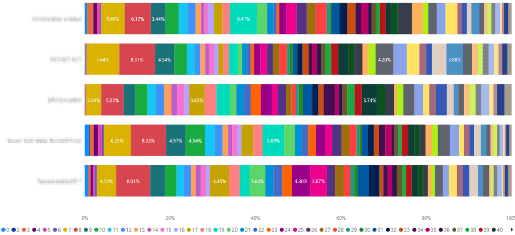
If you have a column containing numeric values in your Power BI report, depending on the graph, it can sometimes be too much and produce some messy graphs, like the below:

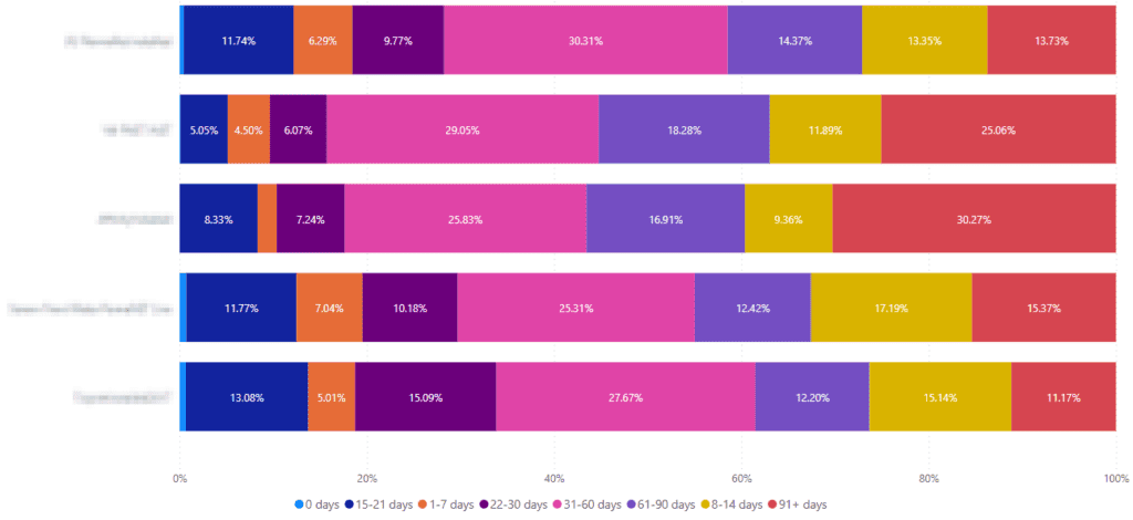
To make this look better, you might want to group the data into ranges instead, to make it easier to read. For example, if you have a list of people, and wanted to display a number of days since they last communicated with you, you might group them as below:
- 0 days
- 1-7 days
- 8-14 days
- 15-21 days
- 22-30 days
- 31-60 days
- 61-90 days
- 91+ days
If you have thousands of items in your report, grouping the results like this could make your graphs look my nicer and result in something easier to read.
To do this, please follow the below steps:
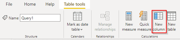
1) Switch to the data view

2) Make sure you have your table selected, in my case, I only have one

3) Select ‘New column’

You should then see the below

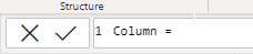
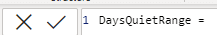
4) Where it says ‘Column’, this is what you want the new column to be called. Change this to whatever you want your new column to be called, I’ll go with ‘DaysQuietRange’ for mine.

5) Now let’s make the query itself, using if statements. The column in my report with the numeric values is called DaysQuiet, so here’s a simple example to get you started:
DaysQuietRange = if(Query1[DaysQuiet]=0,"0 days","More than 0")Where you see ‘More than 0’, this is what is displayed if the result is anything other than 0. So all we will do is repeat the if statement in stead of the ‘More than 0’ text. The full list mentioned above, will be complicated, so to ease you into this, I’ll just expand the example to include another group:
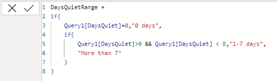
DaysQuietRange = if(Query1[DaysQuiet]=0,"0 days",if(Query1[DaysQuiet]>0 && Query1[DaysQuiet] < 8,"1-7 days","More than 7"))You’ll notice in the second IF statement, I have two filters, as we want all results with more than 0 and less than 8 (e.g. 1-7 days). Hopefully that helps to show how this is done.
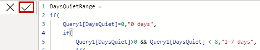
6) We’ll now add the full list in, but as we add more if statements, nested within each other, it can be visually hard to keep track of them, so I recommend expanding the query box by clicking the down chevron to the right, as shown below:


This will change the view to look like this, and then you can start adding some line breaks in (hold the SHIFT key as you press enter to add line breaks), as I have done below:

7) The code for the full list, as per my requirement, is:
DaysQuietRange =
if(
    Query1[DaysQuiet]=0,"0 days",
    if(
        Query1[DaysQuiet]>0 && Query1[DaysQuiet] < 8,"1-7 days",
        if(
            Query1[DaysQuiet]>7 && Query1[DaysQuiet] < 15,"8-14 days",
            if(
                Query1[DaysQuiet]>14 && Query1[DaysQuiet] < 22,"15-21 days",
                if(
                    Query1[DaysQuiet]>21 && Query1[DaysQuiet] < 31,"22-30 days",
                    if(
                        Query1[DaysQuiet]>30 && Query1[DaysQuiet] < 61,"31-60 days",
                        if(
                            Query1[DaysQuiet]>60 && Query1[DaysQuiet] < 91,"61-90 days",
                            "91+ days"
                        )
                    )
                )
            )
        )
    )
)
You can rework the above to work for what you need.
8) When you have your code as you want, click the tick

Then, you can add your new column to your graph/chart, and you should see better results, as I have: