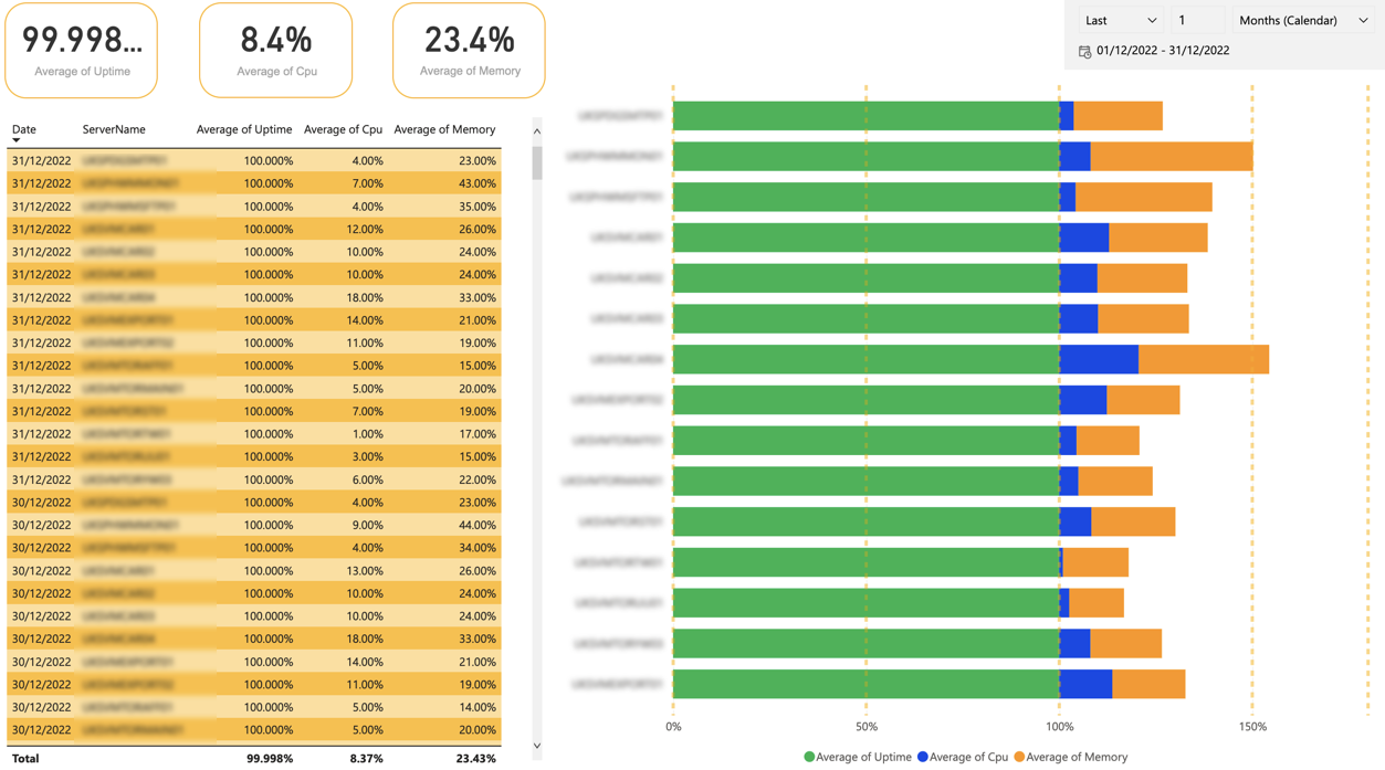
Power BI is a powerful tool for data visualisation and analysis, but it can be overwhelming for new users. Here are some hints and tips to help you get started:
1) Start with a clear goal in mind
Before you begin creating your report or dashboard, take a moment to think about what you want to accomplish. Are you trying to identify trends in your data? Are you looking for specific insights? Having a clear goal will help you stay focused and make it easier to choose the right visualizations and data sources.
2) Take advantage of templates
Power BI offers a wide variety of templates that you can use to quickly and easily create professional reports and dashboards. These templates are a great starting point, and can be customised to meet your specific needs.
3) Use filters and slicers to focus on specific data
Power BI allows you to filter and slice your data to focus on specific aspects of it. This can be a great way to drill down into your data and uncover hidden insights.
4) Take advantage of the Visualisations pane
The Visualisations pane in Power BI is a powerful tool that allows you to add, remove, and customise visualisations on your report or dashboard. You can also use it to switch between different types of visualisations, such as bar charts, line charts, and pie charts.
5) Use the Format pane to customise your visualisations
The Format pane in Power BI allows you to customise the appearance of your visualisations. You can change the colour, size, and other properties of your visualisations to make them more effective.
6) Take advantage of Power BI’s built-in data connectors
Power BI comes with built-in connectors to a variety of data sources, including Excel, SQL Server, and SharePoint. This makes it easy to connect to your data and start analysing it.
7) Learn from the community
Power BI has a large and active community of users who share tips, tutorials, and best practices. You can find a wealth of information online, including blogs, forums, and video tutorials, to help you get the most out of Power BI.
8) Take advantage of DAX (Data Analysis Expressions) to perform advanced calculations
DAX is a formula language that you can use to create custom calculations and aggregations in Power BI. It can be used to create calculated columns and tables, as well as to define custom measures for use in visualisations.
9) Use the Relationships view to control how tables are related
Power BI allows you to create relationships between tables in your data model, which can be used to filter and aggregate data. The Relationships view allows you to define these relationships and control how they are used in your reports and dashboards.
10) Take advantage of Power BI’s mobile capabilities
Power BI allows you to create reports and dashboards that are optimised for viewing on mobile devices. This can be useful for sharing your data with colleagues and stakeholders who are on the go.
11) Use the Q&A feature to get quick answers to questions
Power BI’s Q&A feature allows you to type natural language queries and receive quick answers based on the data in your report or dashboard. This can be a great way to get insights into your data without having to create a visualisation.
12) Keep in mind the data security and governance
Power BI allows you to share your reports and dashboards with others, but it is important to be aware of the data security and governance implications of doing so. Make sure you understand the security settings and permissions available in Power BI and use them to protect your data.
By following these hints and tips, you’ll be well on your way to creating effective and informative reports and dashboards with Power BI.

